


Pickles
During my time working with Walt’s, a local retail brand, I played a hands-on role in streamlining day-to-day operations and expanding the company’s community presence. My work blended creative marketing with logistical execution, bridging product delivery, invoicing, and digital brand management to strengthen Walt’s visibility and customer engagement.
Key Contributions & Ownership
Managed end-to-end invoicing for retail accounts, ensuring timely payment tracking and clear documentation for internal records.
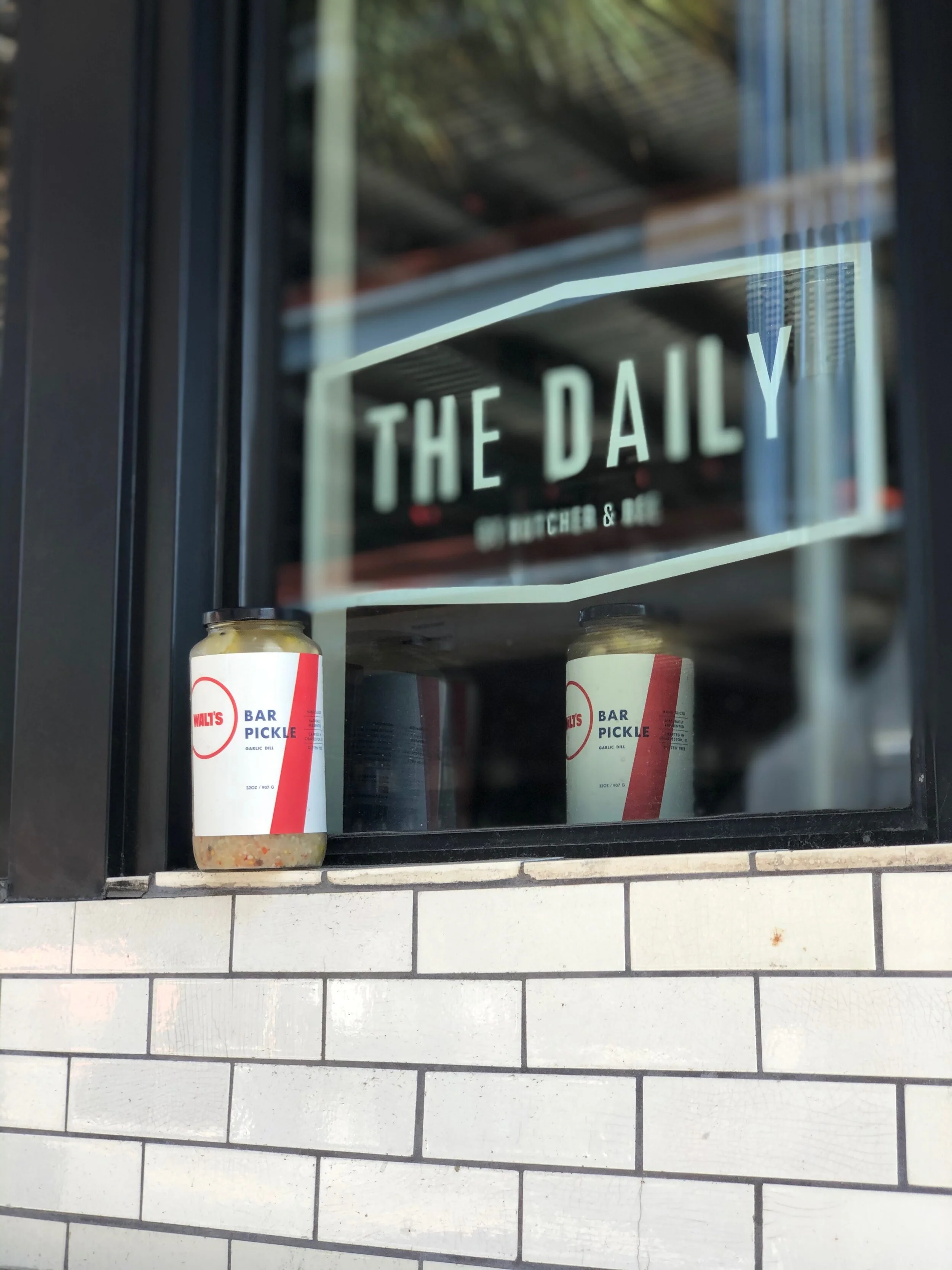
Delivered products to local stores on a recurring schedule, maintaining relationships with owners and verifying stock quality and display.
Oversaw website updates and Instagram promotions, aligning seasonal campaigns with in-store product drops to drive engagement and sales.
Developed creative content and brand materials such as posters, short videos, and event promotions by coordinating with local photographers, stylists, and skaters for authentic storytelling.
Contributed to campaign ideation, crafting new ways to highlight Walt’s connection to the local creative community and lifestyle scene.
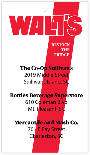
Walt’s Jar Hangtag – Brand Design Element Purpose: Enhance brand recognition and create a tactile, memorable experience for customers purchasing in-store or online. Concept Overview: The hangtag was designed as a small but impactful brand touchpoint for Walt’s locally made jars. It combined clean visual branding with a rustic, handcrafted feel to match the product’s identity. Visual Notes: Front: Walt’s logo centered in bold serif font with a minimal background, emphasizing authenticity and local craftsmanship. Back: QR code linking to the Walt’s Instagram and website, short tagline (“Made local. Shared with care.”), and space for batch/date or flavor notes. Material: Matte recycled cardstock with natural fiber twine for attachment. Tone: Earthy, approachable, and community-focused—aligning with Walt’s mission to blend local product with lifestyle branding.

Walt’s Jar Hangtag – Brand Design Element Purpose: Enhance brand recognition and create a tactile, memorable experience for customers purchasing in-store or online. Concept Overview: The hangtag was designed as a small but impactful brand touchpoint for Walt’s locally made jars. It combined clean visual branding with a rustic, handcrafted feel to match the product’s identity. Visual Notes: Front: Walt’s logo centered in bold serif font with a minimal background, emphasizing authenticity and local craftsmanship. Back: QR code linking to the Walt’s Instagram and website, short tagline (“Made local. Shared with care.”), and space for batch/date or flavor notes. Material: Matte recycled cardstock with natural fiber twine for attachment. Tone: Earthy, approachable, and community-focused, aligning with Walt’s mission to blend local product with lifestyle branding.
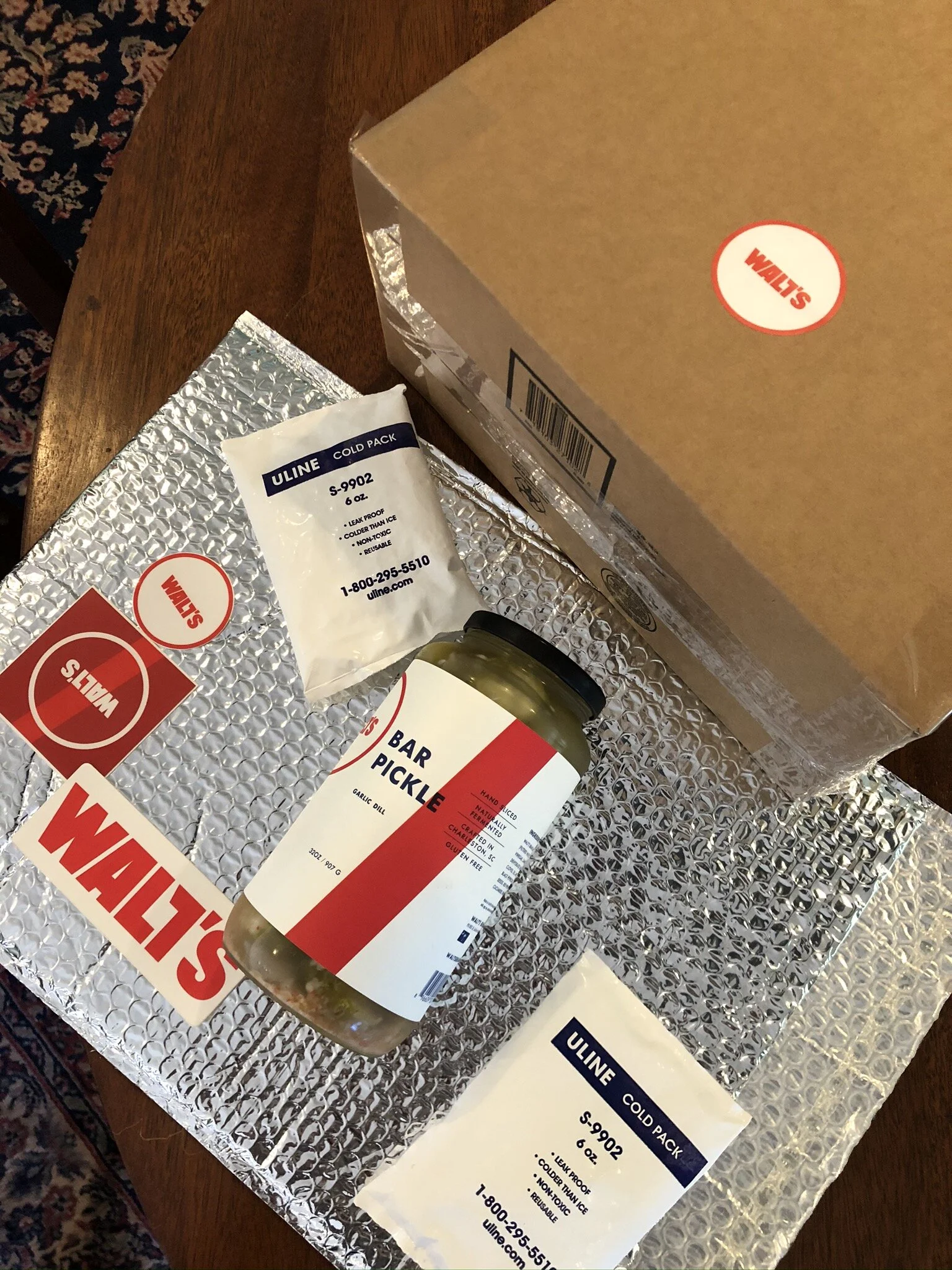
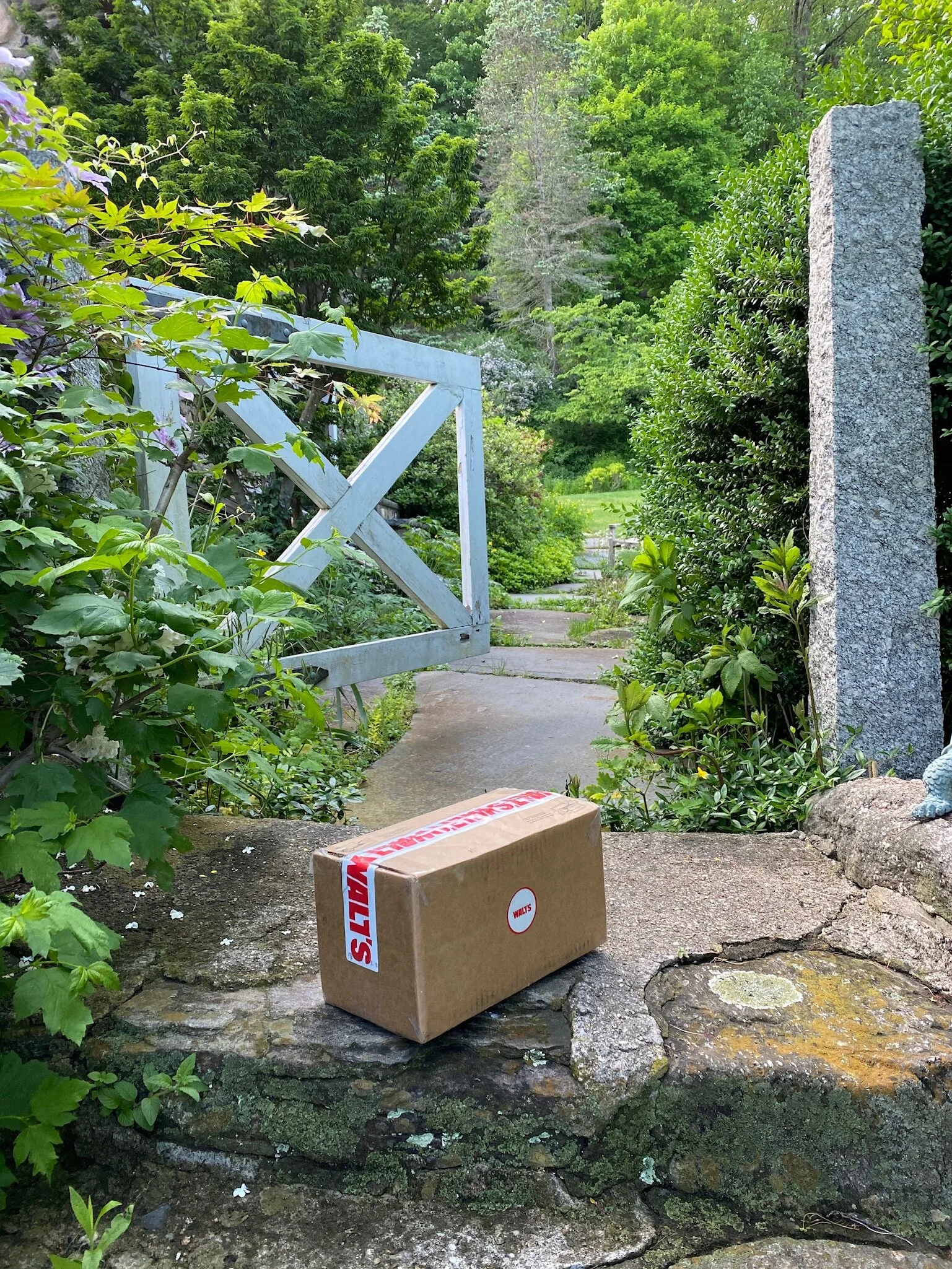
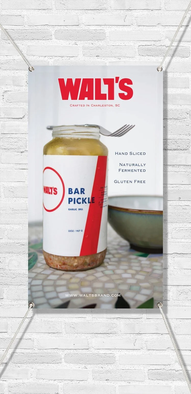
Walt’s First Online Order Delivery – Trial Launch Kit Purpose: Showcase the first official rollout of Walt’s online ordering experience, highlighting attention to quality, presentation, and customer experience. Description: This photo captures the trial run of Walt’s first online delivery package, designed to bring the in-store experience directly to customers’ doors. Each shipment was assembled with care to ensure both product integrity and a cohesive brand presentation. Included in Each Package: Cold packs to preserve product freshness during transit. Hangtag and stickers to reinforce brand identity and add a personal touch. Order insert thanking customers for supporting the local trial launch and inviting feedback via QR code. Outcome: Helped establish the framework for Walt’s e-commerce fulfillment process, balancing functional packaging with brand storytelling.
Promotional Content
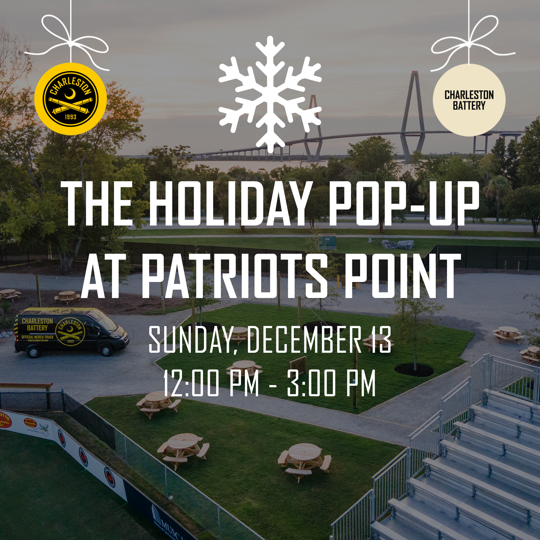
Walt’s Holiday Market Announcement – Seasonal Campaign Purpose: Promote Walt’s participation in a local holiday market and strengthen community engagement through brand visibility and event-based storytelling. Description: This post announced Walt’s first appearance at the local holiday market, celebrating the brand’s connection to community and craft. The design featured seasonal colors, the Walt’s logo, and imagery of signature jar products to attract both returning and new customers. Highlights: Social Media Post: Created and published on Instagram and Facebook to announce event details, location, and featured products. Visual Design: Combined festive tones with clean typography for a professional yet inviting look. Content Strategy: Encouraged pre-orders, in-person visits, and tagged local vendors to increase reach and engagement. Outcome: Drove new foot traffic to Walt’s booth and helped expand brand awareness among local market visitors.

Walt’s Holiday Market Announcement – Seasonal Campaign Purpose: Promote Walt’s participation in a local holiday market and strengthen community engagement through brand visibility and event-based storytelling. Description: This post announced Walt’s first appearance at the local holiday market, celebrating the brand’s connection to community and craft. The design featured seasonal colors, the Walt’s logo, and imagery of signature jar products to attract both returning and new customers. Highlights: Social Media Post: Created and published on Instagram and Facebook to announce event details, location, and featured products. Visual Design: Combined festive tones with clean typography for a professional yet inviting look. Content Strategy: Encouraged pre-orders, in-person visits, and tagged local vendors to increase reach and engagement. Outcome: Drove new foot traffic to Walt’s booth and helped expand brand awareness among local market visitors.
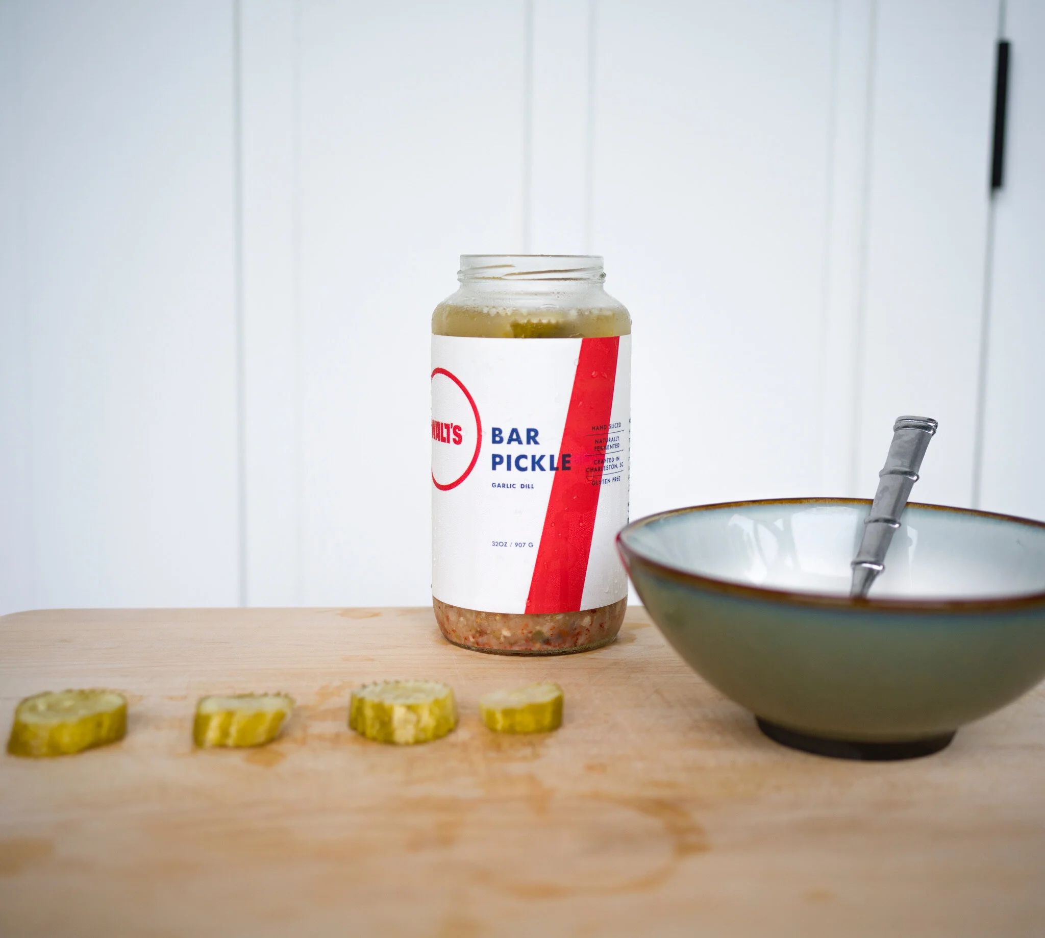
Purpose: Develop a large-scale banner to showcase Walt’s products and identity at markets and retail locations, using locally sourced photography to ground the brand in its community. Description: After partnering with a local photographer to capture product and lifestyle imagery, I transformed the photos into a cohesive banner design for use at events and in-store displays. The goal was to create a visually strong, instantly recognizable piece that reflected Walt’s craftsmanship and community focus. Highlights: Selected and edited photography from a local creative collaborator to align with brand tone and aesthetic. Designed full-scale event banner using clean composition, color balance, and logo integration for high visibility. Oversaw print preparation and material selection to ensure professional quality and durability for outdoor and retail use. Implemented at local markets and partner stores, enhancing brand recognition and customer engagement.
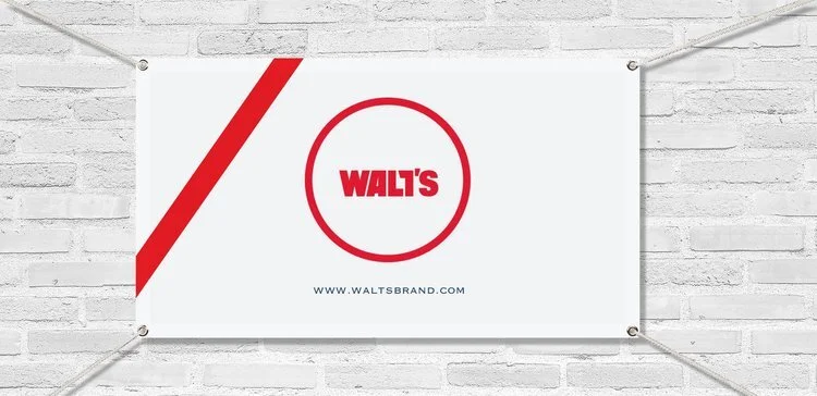
Purpose: Develop a large-scale banner to showcase Walt’s products and identity at markets and retail locations, using locally sourced photography to ground the brand in its community. Description: After partnering with a local photographer to capture product and lifestyle imagery, I transformed the photos into a cohesive banner design for use at events and in-store displays. The goal was to create a visually strong, instantly recognizable piece that reflected Walt’s craftsmanship and community focus. Highlights: Selected and edited photography from a local creative collaborator to align with brand tone and aesthetic. Designed full-scale event banner using clean composition, color balance, and logo integration for high visibility. Oversaw print preparation and material selection to ensure professional quality and durability for outdoor and retail use. Implemented at local markets and partner stores, enhancing brand recognition and customer engagement.